I KNOW THIS IS LATE 
BUT 

I FELT THIS WAS NECESSARY

I DO NOT LIKE MY MANIFESTO POINTS ANYMORE

I WROTE THOSE IN MY SUMMER HOLIDAYS

AND I HAVE BEEN BACK IN COLLEGE FOR QUITE SOME TIME 

I FEEL DIFFERENT AND HAVE MADE SOME CHANGES TO MYSELF

SO ALL THOSE OLD POINTS DO NOT SHOW THE CURRENT ME


SO I WANT TO CHANGE MY MANIFESTO POINTS


*1 _  MINIMAL ALWAYS, NEVER OVER DO SOMETHING
YOU WILL REGRET IT LATER ON

*2 _  WHEN WORKING TRY TO USE YOUR INTERESTS        
AND HOBBIES TO INFLUENCE YOUR WORK
THAT WAY IT'S MORE PERSONAL

*3 _ I HAVE DREAMS AND AMBITIONS THAT ARE       OUTSIDE OF DESIGN
BUT THE FOUNDATION OF THESE DREAMS RELY                  ON DESIGN SO I MUST FOCUS

*4 _ WHEN WORKING DO NOT LISTEN TO MUSIC WITH LYRICS 
IT WILL DISTRACT YOU
CALM WAVE MUSIC IS THE STUFF

*5 _ STRENGTHEN YOUR WEAKNESSES

*6 _ CREATE YOUR OWN UNIQUE STYLE

*7 _ WORK IS IMPORTANT 
BUT SO IS RELAXING
WHEN YOU ARE RELAXING YOU CAN STILL BE DOING WORK


*8 _ THE BEST IDEAS COME TO YOU WHEN YOU ARE RELAXING
SO TRY NOT TO STRESS TOO MUCH


*9 _ DO NOT SPEND ALL YOUR TIME ON A COMPUTER
IT WILL MAKE YOU TIRED AND NOT CREATIVE
GO OUT 
AND EXPLORE
AND CREATE

*10 _ TRY TO BE HAPPY


AFTER EFFECTS


DUE TO NOT BEING ABLE TO GET HOLD OF ADOBE ILLUSTRATOR 
EVEN AFTER MULTIPLE TRIES

I FINALLY GAVE UP AND USED ADOBE AFTER EFFECTS


i saw a lot of videos and pictures on tumblr and youtube that really inspired me to try and make something similar,
so i starting looking into colours and fonts, which i have already posted about before
and then i started


this is my final piece
I'm not sure if it's a manifesto or not


^extremely low q
will play off usb

ANTI DESIGN FESTIVAL

ANTI DESIGN FESTIVAL
ANTI DESIGN FESTIVAL 
ANTI DESIGN FESTIVAL
ANTI DESIGN FESTIVAL 


https://antidesignfestival.files.wordpress.com/2010/07/adf_header2.png


London’s most anticipated art and design event launched in September 2010

As a response to 25 years of cultural deep freeze in the UK
the Anti Design Festival attempted to
unlock creative fires and ideas
exploring spaces hitherto
deemed out-of-bounds
by a purely commercial criteria


Directed by Neville Brody 
the world-renowned graphic designer


THIS PIECE STANDS OUT TO ME 
FIRSTLY BECAUSE THE COLOUR HURTS YOUR EYES

SECONDLY BECAUSE THE YELLOW BACKGROUND
MAKES THE BLACK TEXT STAND OUT IN A REALLY POWERFUL ANNOYING SORT OF WAY

i really like how they crossed out their logo
it's makes it edgy and banksy-ish

but i do like the way they switched the bold capital letters around, it looks abstract


this piece i like a lot more
it's cleaner and there's a lot of space so it's easy to look at without getting a headache

the logo being crossed out looks really cool again
but this time they went for a different approach with the title of the event/festival

they turned it upside down with the capital letter being on top
it's really simple but it fits and they pulled it off really well
i checked out some images from the festival and it looked really experimental, cool and interesting /


KEN GARLAND


https://soapboxpress.files.wordpress.com/2013/03/48270b_f191b3daefb2e1c0cb3e7021ac12b260.jpg

KEN GARLAND
British
Graphic designer
Photographer
Writer
Educator

He has made a significant contribution to the development of graphic design
since the mid-twentieth century and formed the prolific design studio
Ken Garland & Associates
in 1962-2009 
in Camden 
London 

where he continues to live and work


by : Ken garland
named: first things first
date : 1964

Written in 1963
Published in 1964
by Ken Garland

along with 20 other designers / photographers / students

it was backed by over 400 graphic designers and artists
and also received the backing of
Tony Benn
radical left-wing MP and activist
who published it in its entirety in the Guardian newspaper
 

the manifesto was a reaction to the staunch society of 1960s Britain
and called for a return to a humanist aspect of design
It lashed out against the fast-paced and
often trivial productions of mainstream advertising
calling them trivial and time-consuming
It's solution was to focus efforts of design on education
and public service tasks that promoted the betterment of society

to me this piece is history and the amount of designers that backed and signed it is astounding
the design is simple and minimal whilst the large title has a strong clean font that stands out


‘First Things First’
written 35 years ago in London
by Ken Garland
and signed by 21 other visual communicators


BRUCE MAU


http://www.rustylong.com/wp-content/uploads/2011/01/MAU_portrait.jpghttps://segal.northwestern.edu/images/people/profile-photos/bruce-mau-profile-main.jpg


BRUCE MAU

Born October 25th /1959
Canadian designer
Studied at the Ontario College of Art & Design /Toronto

From 1985-2010
Mau was the creative director of Bruce Mau Design
and the founder of the 'Institute without Boundaries'

He started as a graphic designer but later veered his career towards the worlds of:
architecture
art
museums
film
eco-environmental design
conceptual philosophy


;

After looking through Bruce Mau's work i found a lot of manifestos and posters of his that i really liked, the designs and the messages he gives off through his work are really inspirational and well done.


[bruce mau __ incomplete manifesto for growth]
  

This piece is probably his most famous as i kept seeing it everywhere i looked for his work
It's almost like a guide for designers, whether it be artists, architects or graphic designers

He includes a lot of points in this piece which are all really thought out and ones you can use in your lives

I really like the black and white
I really like how he has 43 points
but highlights only a few
the ones he made to stick out are the ones with deep titles that a reader would immediately jump to and capture their attention

"DONT BE COOL"
"LAUGH"
"POWER TO THE PEOPLE" 


This is a cropped / zoomed in
version of his original piece 

I found it right next to his actual piece on a website but i feel like these few points were done especially for students, 
young people who are trying to enter this industry


DIETER RAMS


DIETER RAMS


Dieter Rams
born;
Wiesbaden
Germany
1932


Rams’s early awards for carpentry
led to him training as an architect
as Germany was rebuilt in the early 1950s


Rams became a protégé of the Ulm School of Design
(successor to the Bauhaus)
luminaries Hans Gugelot / Fritz Eichler / Otl Aicher


;


this is a quote style poster of Dieter Rams
pretty sure it's not done my Dieter Rams himself but I found it on a site 
that was talking about "lessons in style by dieter rams"


this piece really stood out to me 
it's so simple and easy to make yet i still like it a lot
it's how clean and professional it is that it gives it a nice aesthetic

for example i really love the way the picture of him is right next to the text and it's a little smaller than the text and put in the right hand side of the picture 
which makes it look like an I.D

secondly the text on the left hand side is in such an attractive font, it's simple and professional and the quote finishes with his name in a different colour which makes it stick out and become more bold

it may not be a manifesto but i am still inspired by this piece and will definitely try something out like this in my manifesto


this is a piece:

by Dieter Rams


named:

'10 principles of good design'


I just really love the simplicity in this design

there's:
10 points
10 pictures

it's in black and white 
it has a clean cut font
it's very monochrome
and to top it all off it has a solid clean aesthetic

whats not to love

this piece just inspires me in general
not just for my manifesto but for all my work hopefully

two of the points that i really loved on this manifesto are:


Good design is long-lasting

It avoids being fashionable and therefore never appears antiquated.
Unlike fashionable design, it lasts many years 
even in today’s throwaway society


Good design is as little design as possible

Less, but better
because it concentrates on the essential aspects
and the products are not burdened with non-essentials

Back to purity, back to simplicity.


VORTICISM


The Vorticists
were a British avant-garde group formed in London in 1914
w/ the aim of creating art
that expressed the dynamism of the
modern world 


Edward Wadsworth, 'Abstract Composition' 1915 

 
Vorticist painting combines cube style fragments with hard-edged imagery inspired by the urban environment.

  founded by the artist, writer and polemicist
  Wyndham Lewis
he considered to be the effeteness of British art and culture and proclaiming the vorticist aesthetic
/partly inspired by Cubism/


Experimental paintings and sculpture using angular simplification and abstraction
by Lewis, Wadsworth, Shakespear and others, were shown
at the Rebel Art Center in 1914
before the formation of the actual Vorticist Group//


To be absolutely honest this movement isn't something I'm too interested in or inspired by, it's creative and cool and abstract but I'm not liking it as much as i did the other movements i looked into


but this piece did stand out to me and I do like some aspects of it 
such as
the pattern of the shapes
the way the first and third ones are distorted
whilst
the second and fourth are in a normal shape
it makes it seem quite trippy 


it also reminds me of 

Salvador Dali's piece

The Persistence of Memory


 but i do not plan on really using this type of style in my manifesto work


FUTURISM


Futurism was an art movement launched by the Italian poet
Filippo Tommaso Marinetti in 1909


On the 20th of February he published his Manifesto of Futurism on the front page of the Paris newspaper Le Figaro 


That moment saw the birth of the Futurists,
a small group of radical Italian artists working just before the outbreak of the First World War


The Futurists rejected anything old and looked towards a new Italy.


What the Futurists wanted was art that celebrated the modern world of industry and technology.


;


 one of the pieces of futurism i really liked
i like the the way they experimented with the text and it came out looking really abstract, the black and white rays shine onto the words and it creates an effect inside the letters, another thing i really liked in this piece


- the D going into the E
and 
the R going into the O -

was another thing i liked
it creates a sort of collage type look and i can see myself doing this sort of style somewhere in my manifesto


this is something i found on the internet that was inspired by Futurism but also Dadaism
it has a twist of both and i really like this piece

the solid colours with the solid text on top and the clean cut finish really inspires me for my manifesto, i'd love to be able to achieve a look like this

but at the same time my manifesto ideas are quite grungey and might come out quite messy
so i'll have to see where this comes in my design


(currently thinking it would good as my background for my manifesto but i will change it up a bit to match the rest of my design)


 another piece i really liked the look of
this piece looks amazing all round but the bit that stood out to me 
was the way the person is in front of the text
they masked her out and placed her infront

and for my manifesto i want to do something similar
i already have posted about how i want to paint on top of a picture of a person and put it near my sentence about how colour is important to my work

well by seeing this piece I've had the idea to put the picture i will edit on top of my sentence about colour
to switch it up
thanks for inspiring me internet.


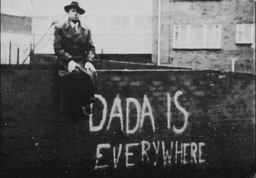
DADAISM


 Dadaism emerged during the brutality of World War 1 from 1914 to 1918

 Dada was an informal international movement, with participants in Europe and North America. 
For many participants, the movement was a protest against the bourgeois nationalist and colonialist interests, which many Dadaists believed were the root cause of the war, and against the cultural and intellectual conformity—in art and more broadly in society—that corresponded to the war.


AS WELL AS BEING INVOLVED WITH VISUAL ARTS AND GRAPHIC DESIGN, THEY WERE ALSO INTO POETRY / MUSIC / PERFORMING ARTS AND LITERATURE
According to Hans Richter Dada was not art:
 it was "anti-art." 
 Dada represented the opposite of everything which art stood for.
 Where art was concerned with traditional aesthetics, Dada ignored aesthetics.
 If art was to appeal to sensibilities,

 Dada was intended to offend. 

;


MY FAVORITE PIECE OF DADAISM
I LOVE THE COLOURS AND THE LITTLE BLACK AND WHITE PICTURE AT THE BOTTOM RIGHT WHICH HAS BEEN CUT OUT AND REPLACED WITH A NEWS ARTICLE
I ALSO LOVE THE WAY THE SUIT HAS BEEN CUT OUT AND REPLACED WITH SOMEONE ELSE'S HEAD, IT LOOKS REBELLIOUS AND GRUNGEY/DIRTY
IT DEFINITELY INSPIRES MY WORK WHICH I PLAN ON DOING IN A SIMILAR STYLE;
HAVING RANDOM BITS AND PIECES PLACED AROUND THE PICTURE
I CAN DEFINITELY SEE ME APPLYING SOME OF THIS INTO MY MANIFESTO  


I HAVE FOUND SOMETHING SIMILAR TO THIS ON TUMBLR

feeling blue?
  IT'S NOT DADAISM BUT I GET A SIMILAR FEEL FROM THIS
THE PAINTED OVER FACE AND THE TEXT MAKES ME ADMIRE THIS PIECE AND I PLAN ON REPLICATING THIS INTO MY WORK

ADDING IT SOMEWHERE NEAR MY SENTENCE ABOUT HOW COLOUR IS IMPORTANT TO MY WORK
I'M THINKING OF GETTING A PICTURE OF SOMEONE IN BLACK AND WHITE AND ADDING SOME COLOURS ONTO THE PICTURE
SUCH AS COLOURING IN HIS/HER BODY PARTS
(the hands coloured in etc)
i also want to keep the person anonymous 
i feel like it adds some mystery to it and gives it a better feeling than revealing the persons face,
so i plan on adding flowers to the persons face so it matches with my sentence on how colour is important to my work.
i plan on doing this all on ps/ai
the colouring in i can do with brushes on ai
and the flower on face can be done on ai also 


here is something else
quite similar


"I don’t do drugs.
I am drugs."
  -Salvador Dali


LINE DRAWING


Last year I tried to get into line drawing for a poster i wanted to make
and did a very rough copy and it was messy and quite ugly but i liked it for some reason 
now i want to do the same

I plan on using the line drawing style as its really plain and simple looking and i like that about it.
It's always done in black and white and well, done in lines and not filled in nor coloured 
it can be hand rendered or even done on computer, whichever suits you best

here are some examples
(found on tumblr/pintrest)


https://40.media.tumblr.com/7434f5e77a2f00f01ae2dfb33561c950/tumblr_mr7oismuKI1s5dh8co1_500.jpg 
  

 I plan on doing this on computer as i would find it easier and smoother to do
I plan on adding it near my sentence about art and how i want to get better at it
A lot of the time these designs/drawings look weird but in a cool type of way so i want to include this in my manifesto as it would look abstract and weird and also add to my manifesto's design and hopefully match the rest of the designs i plan on including in my manifesto.

MANIFESTO DESIGN IDEAS


I've got my words / sentences that I want to include in my manifesto ready
Now i have to start thinking about how i want the design of the actual manifesto to look

I went on Pintrest / Tumblr and Google and looked up some designs that would suit my manifesto idea

I didn't look into manifesto's straight away
I looked through some designs that I liked
Designs i found aesthetically pleasing


- I wanted to have part of my manifesto design to be a search bar
like when you search something on google and recommendations pop up
i wanted my sentences to pop up as recommendations
i think it would look cool

e.g


but that's only part of my idea
the rest is going to be different


- Another idea i had was having a sentence(s) appear as a text(s)

Technology has changed a lot in these past few years and i wanted to somehow show that in this little design idea

So what i thought of doing was having 2 sentences show up as texts

One being in the style of an old text
and another 
being in the style of a new text


examples of old texts

http://i.dailymail.co.uk/i/pix/2012/11/28/article-2239849-1640FBCC000005DC-960_306x520.jpghttp://flowtv.org/wp-content/uploads/2013/01/Text-message.png 


examples of new texts

http://bitesms.com/images/biteSMS-device5.pnghttp://www.conceptdraw.com/samples/resource/images/solutions//Software-development-iPhone-User-Interface-Messages10.png


the old texts are obviously really pixelated and on small screens whilst the new texts are on large clear screens and are smooth and high quality


I'm planning on writing a short sentence as an old text as the screen will not be able to show too much
(also i feel that short texts will have more effect and will look better)

and i will write 2 or 3 sentences as new texts 
as it will look cleaner than just having one sentence and an empty screen
or 
having too much sentences that the viewer cannot be bothered reading it all


For the new text i am planning on
getting one of my friends(most likely my mom)
to text me one of the sentences and then me replying with the other sentence 
then screenshotting that and taking it into photoshop and adding some minor adjustments

As for the old text
I'll most likely find a picture of an old phone at a good angle and add some text on it w/ photoshop 
or try and find an old phone and write up a text(probably the first one due to laziness)


- As far as fonts go i plan on using really simple clean fonts that are minimal and professional such as

Arial
Aurulent sans
Colaborate
Comic sans 
Helvetica
Titilium
Vegur

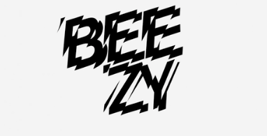
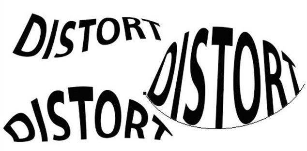
For words that i want to highlight and draw attention to I will probably go about doing something such as distorting the text, pixelating the text and changing the colours etc.

 e.g


- For colours I plan on using light colours such as pink and blue and white etc
Colours that are easy and calming to look at
I'll try to avoid yellow as it's just not a nice colour 
(also minions are yellow and i hate minions)


 I also have other ideas that I want to use but they're similar to these or just ideas that i probably wont put in my work
I'm looking for more ideas and will post on my blog if i find any